
LOGO DESIGN
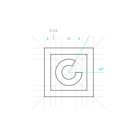
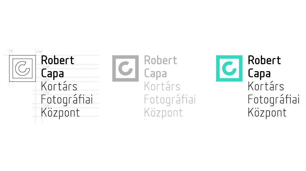
The first component of this value conveying image that we formulated was the Capa Center logo, where the letter “C” was put into spotlight as an icon to signify the institute. The letter “C” is also regarded as a symbol of copyright, thus the logo invokes the idea of authorship, to highlight how photographic images can also be viewed as creative works of art. The seal-like character was meant to present the C logo as a trademark on program booklets and other printed materials.
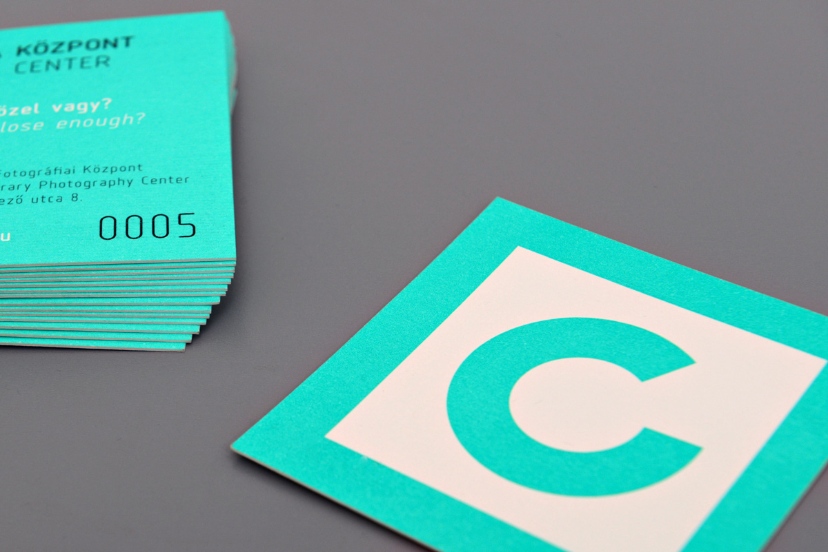
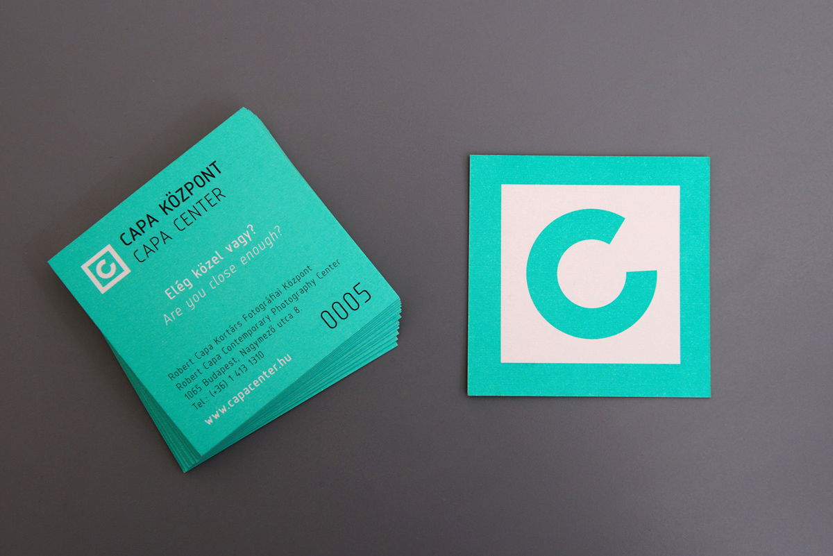
The Capa Center entry pass is a thick carton card, designed to be kept as a souvenir.
IMAGE COLOR SHEME AND LETTERING CONCEPT
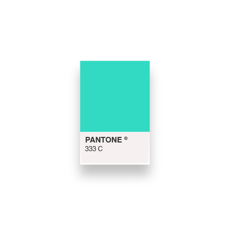
In our image plan we wanted to involve a color that accentuates the contemporary quality of the establishment, one distinguishable from all the visual background noise. Several art institutes and centers, such as Vienna’s MuseumsQuartier, have used bold neon colors in their communication. The choice of a vibrant turquoise Pantone color is fresh, striking, and in tune with the contemporary art scene.
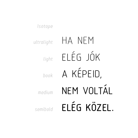
The font used in our image scheme is a designer font with a techy touch, decidedly geometrical, the 18 characters can be used flexibly and are pleasant to read in continuous text as well as titles. Its “scientific” character links it to the technical medium of photography, and a refined, modern style.
EXHIBITION IMAGE DESIGNS
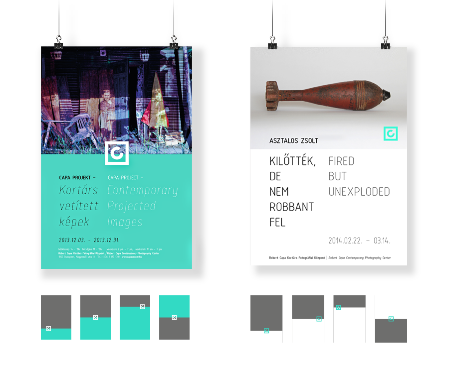
The design and creation of a basic image had us conduct continual image communication work for Capa Center, whereby we created each individual exhibition’s own image, all in harmony with the institute’s basic image.
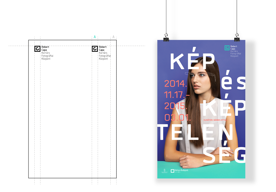
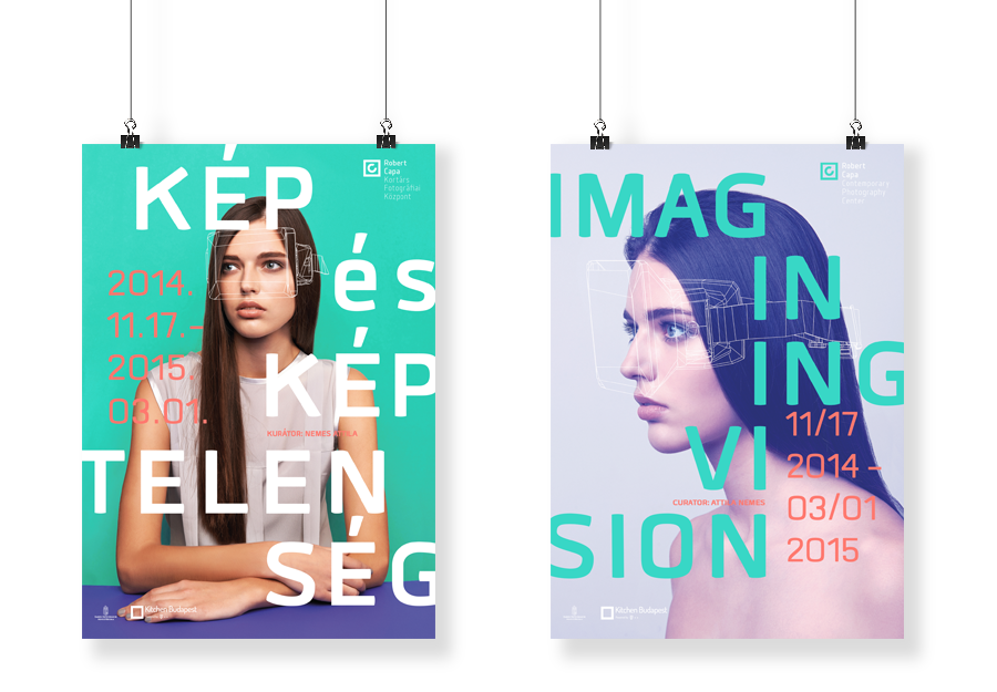
Our exhibition image designs included the 32nd Hungarian Press Photo Exhibition, the exhibitions Bőrödön Viseled curated by Kata Oltai, as well as Kép és képtelenség curated by Attila Nemes in partnership with Kitchen Budapest.
PRINTED MATERIAL SYSTEM – INSTITUTIONAL DOMINANT
PRINTED MATERIAL SYSTEM – EXHIBITION DOMINANT
Our message
The Capa Center image achieves genuine transparency and discernibility, and continues to make an impact on every exhibition. A hallmark of this innovative image’s success is its boost to the exhibition promotional PR campaigns, which are to this day aimed to attract photography and art enthusiast audiences to the Capa Center and perpetuate its positive image.
200
PRESS APPEARENCES DUE TO "KÉP ÉS KÉPTELENSÉG" EXHIBITION
50
NATIONAL TV- ÉS RADIO APPEARENCES


